Client challenge
The agency needed a website that explained services quickly, built credibility, and guided visitors toward a clear contact path.
German Losada
Project overview
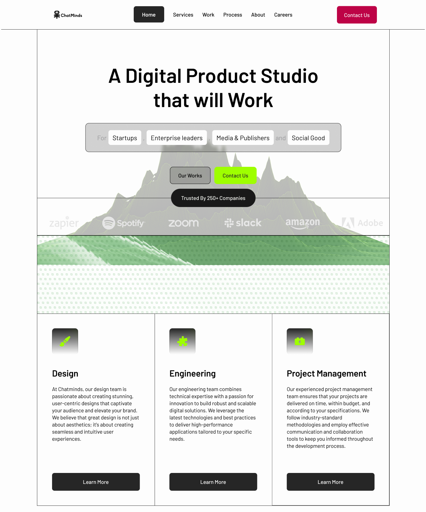
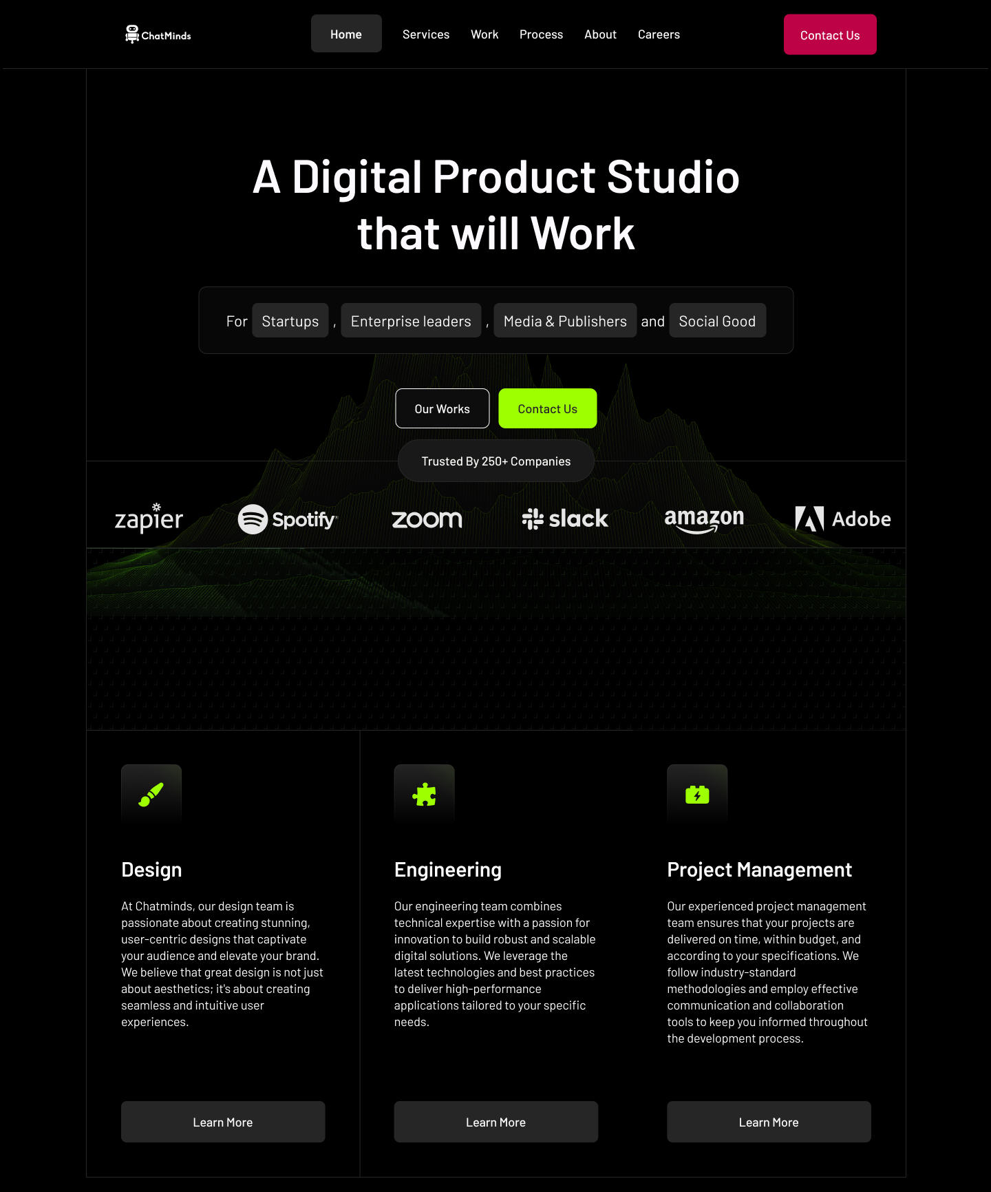
The redesign turns the website into a clearer sales tool. It uses direct messaging, service-focused content, visible proof, and responsive UI patterns to help visitors decide whether the agency is the right partner.
The agency needed a website that explained services quickly, built credibility, and guided visitors toward a clear contact path.
I shaped the UX strategy, page structure, visual direction, responsive UI, and front-end implementation for the redesigned experience.
Small business owners, founders, and marketing teams comparing agency partners before booking a consultation.
Turn a visually interesting site into a conversion-focused experience with stronger hierarchy, proof, and service discovery.
UX strategy
Instead of relying only on visual polish, each section supports a decision moment: what the agency does, why it is credible, what outcomes it creates, and how to start a conversation.
Services were grouped around buyer needs so visitors could understand what the agency offers without reading long paragraphs.
Proof points, project visuals, and outcome-driven messaging were placed earlier to reduce hesitation before the CTA.
The layout was rebuilt with stable spacing, readable typography, and clear sections across desktop, tablet, and mobile.
Conversion architecture
65%
Important proof and service sections were moved higher to support faster evaluation.
+48%
Clearer CTAs and better content order created a stronger path from browsing to inquiry.
4
Hero, services, proof, and contact modules work together as one conversion flow.
Design system
High-contrast black and white foundation for a premium agency feel.
Large Barlow headings paired with compact body copy for fast scanning.
Reusable cards, buttons, image modules, and content bands for consistent pages.
CTA hierarchy designed around one primary action and supportive secondary links.
Outcome
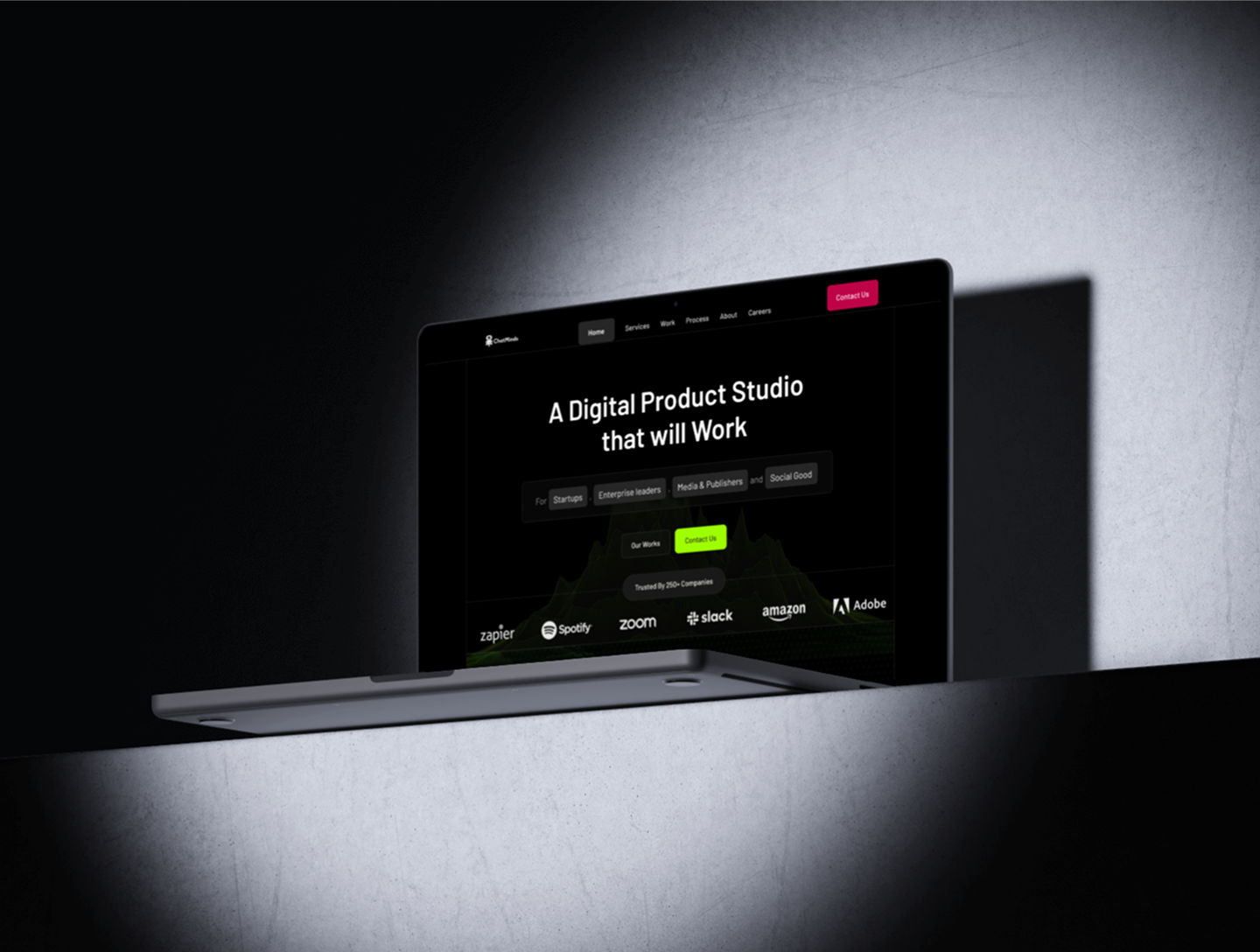
The new opening screen communicates what the agency does, who it helps, and why visitors should keep scrolling.
Each section now has a job: clarify value, build trust, answer objections, or move users toward contact.
The content structure and reusable patterns make it easier to expand the site with new services and campaign pages.