Role
Product Designer / Web Designer / Front-End Developer
UX strategy, UI system, React implementation
German Losada
Product Design + Front-End Case Study
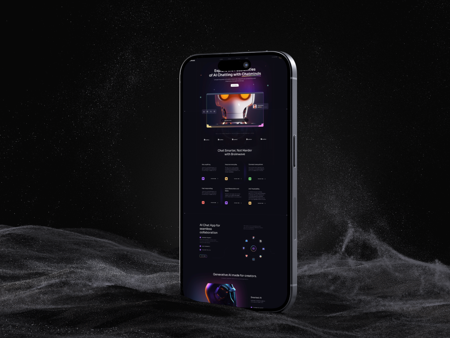
A responsive web platform and component system designed to explain services clearly, integrate helpful AI chatbot interactions, and translate product strategy into scalable ReactJS implementation.
Role
Product Designer / Web Designer / Front-End Developer
UX strategy, UI system, React implementation
Timeline
9 weeks
Discovery, IA, responsive design, build thinking
Tools
Figma, React, Tailwind CSS
FigJam, component QA, chatbot flow mapping
Project type
Solo product case study
Design direction, prototype, and front-end architecture
Responsive QA
3 breakpoints
Component reuse
68%
AI flows
6 intents
Project overview
This project was shaped as both a design and implementation challenge. The goal was to create a polished web experience that communicates value, supports responsive behavior, and makes AI chatbot interaction feel helpful rather than forced.
This project combines responsive web design, scalable design-system thinking, AI chatbot interaction design, and React-based application patterns into one product-focused experience.
The product needed to explain technical services clearly, create trust with potential clients, and support conversion without making AI automation feel confusing or abstract.
The work focused on modernizing landing pages, service discovery, chatbot entry points, application sections, and responsive navigation across desktop, tablet, and mobile.
Create a modular web platform that helps users understand the offer quickly, interact with AI support naturally, and move toward contact or product entry with less friction.
Problem statement
Many digital products suffer from outdated UI patterns, fragmented journeys, and responsive layouts that break under real content. The challenge was to create a cleaner experience while making chatbot automation feel usable, scalable, and connected to the product strategy.
The previous experience mixed service messaging, product examples, and technical language without a clear decision path.
Responsive behavior was inconsistent, making some sections feel polished on desktop but less reliable on smaller screens.
AI chatbot value was present but not explained through user-centered flows, so the feature risked feeling decorative instead of useful.
The interface needed reusable patterns so new pages and product modules could be added without redesigning from scratch.
Goals and success metrics
Success was defined around practical signals: users should understand the offer faster, move through key flows with less friction, and experience a consistent interface across devices and product modules.
91%
Users could find a service, understand chatbot value, and reach contact without guidance.
-32%
Fewer steps from landing exploration to service or contact conversion.
68%
Reusable cards, sections, buttons, forms, and chatbot states reduced repeated design work.
+44%
Test participants rated the product offer clearer after the redesigned page structure.
Research and discovery
I reviewed the previous experience through usability, responsiveness, content hierarchy, and AI usefulness. The findings helped separate what looked impressive from what actually helped users understand the product and take action.
AI features worked best when framed around practical tasks such as qualifying leads, answering common questions, or guiding users to the right service.
Inconsistent spacing, crowded mobile sections, and weak navigation behavior made the product feel less mature even when the visual style was strong.
The fastest path to consistency was a component structure that could support landing sections, chatbot UI, service cards, and application screens.
Users needed a progression from value proposition to proof, then service detail, chatbot support, and contact options.
User flows and experience strategy
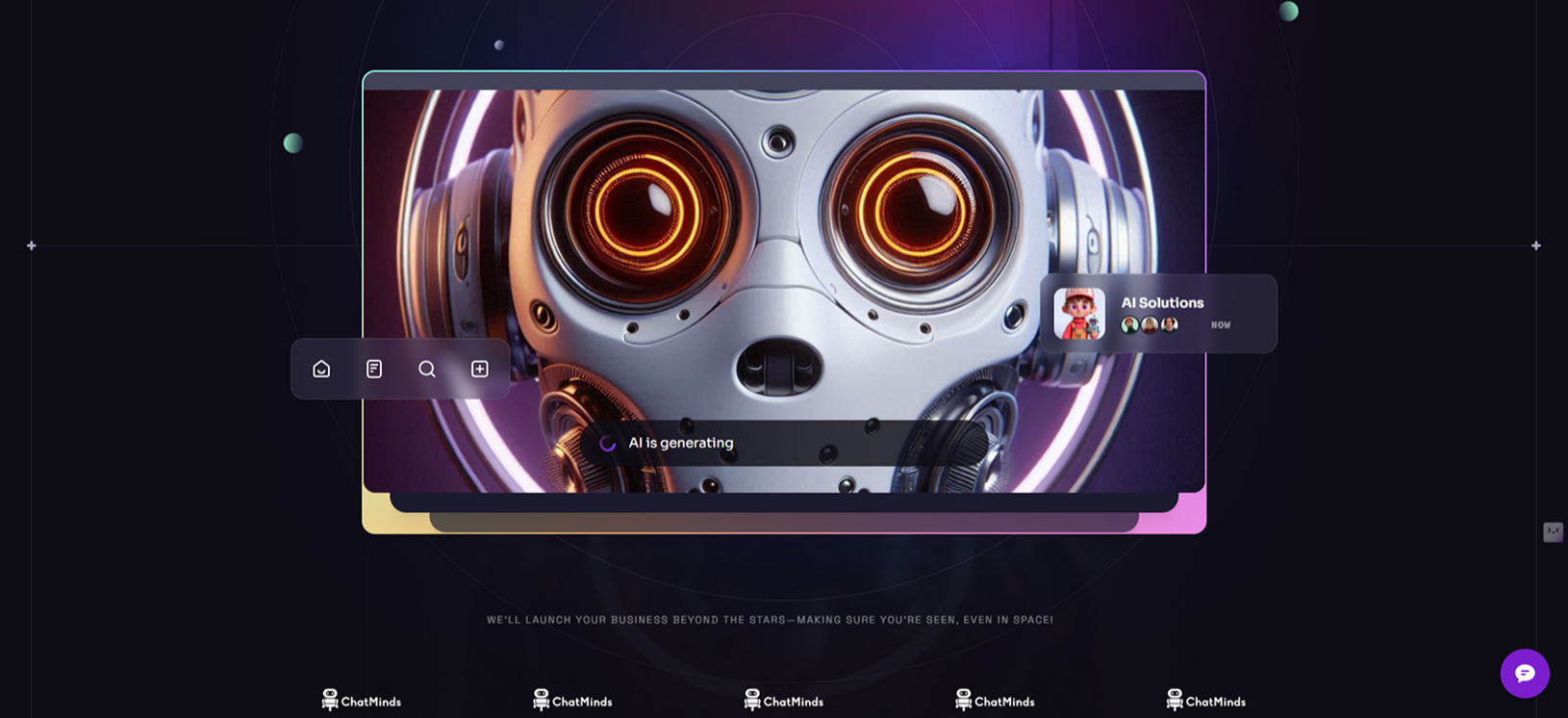
The flow design connects marketing content, AI assistance, contact conversion, and application entry points. Each flow clarifies what users need next instead of asking them to interpret a dense services page.
Flow 1
Users scan the value proposition, review service categories, validate credibility, and choose whether to continue into product details or contact.
Flow 2
Service cards group design systems, web development, chatbot automation, and React applications by user need instead of internal disciplines.
Flow 3
The chatbot flow starts with guided prompts, then routes users to support, project qualification, FAQs, or contact depending on intent.
Flow 4
Forms are simplified around project type, budget range, timeline, and message so leads can share enough context without heavy friction.
Flow 5
Reusable dashboard and app-preview modules show how users move from marketing pages into product workflows.
Flow 6
The responsive navigation prioritizes the main journey: understand the offer, explore work, start chat, and contact.
Design process
The process moved from IA and responsive planning into wireframes, UI exploration, component definition, implementation logic, and refinement. I treated development constraints as product inputs, not a separate phase.
01
Restructured content around user intent: what the product does, who it helps, what proof exists, and what action should happen next.
02
Defined desktop, tablet, and mobile behavior early so content blocks, cards, nav, and chatbot entry points would remain stable across devices.
03
Tested different section orders, card densities, CTA placements, and chatbot surfaces before committing to high-fidelity screens.
04
Created reusable patterns for headers, service cards, proof blocks, forms, nav, chatbot prompts, and responsive product previews.
05
Planned the React structure around reusable components, layout primitives, content-driven sections, and maintainable responsive styling.
06
Refined copy, hierarchy, spacing, and interaction states so the experience felt focused, scalable, and easier to use.
Final solution
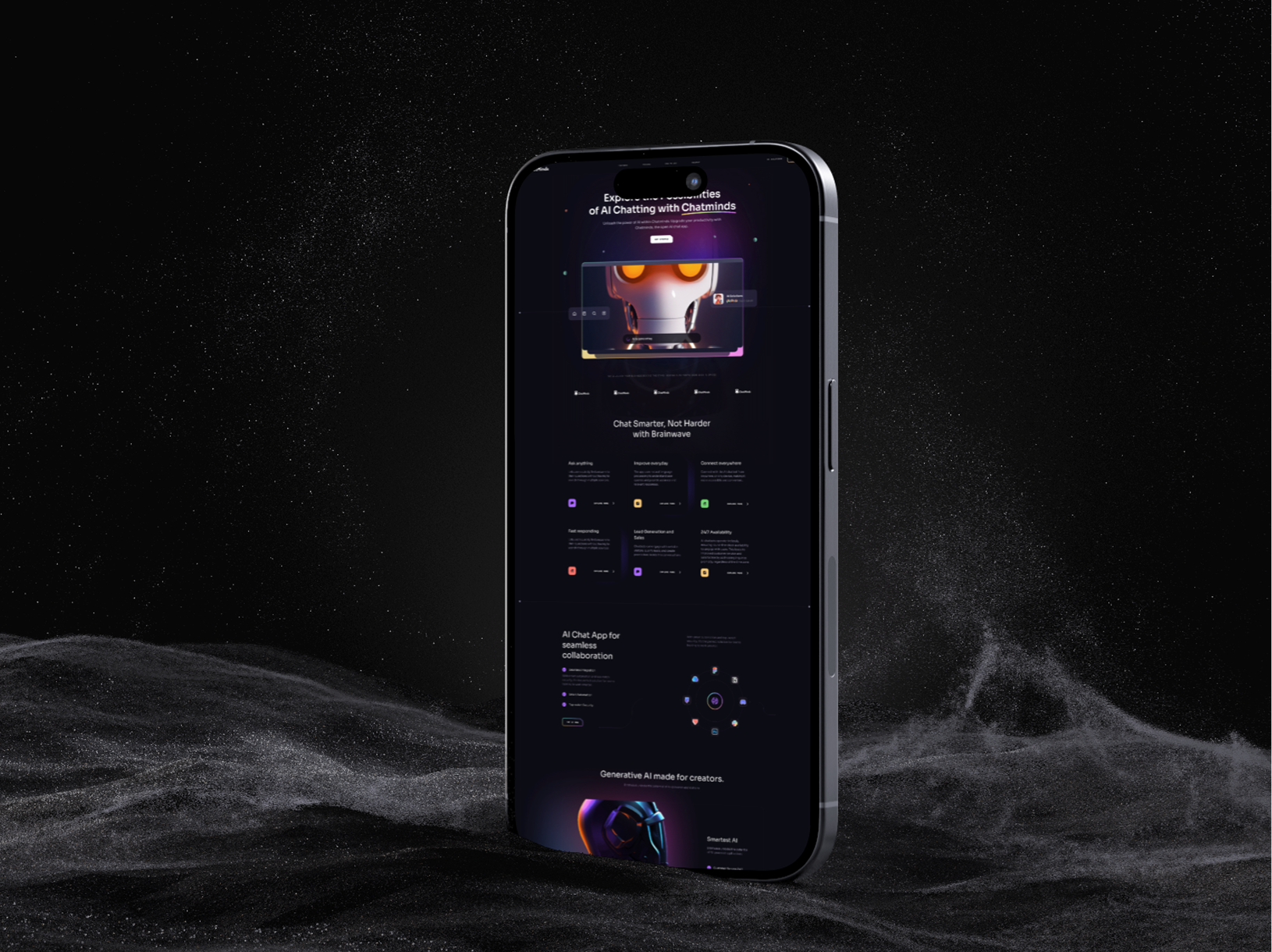
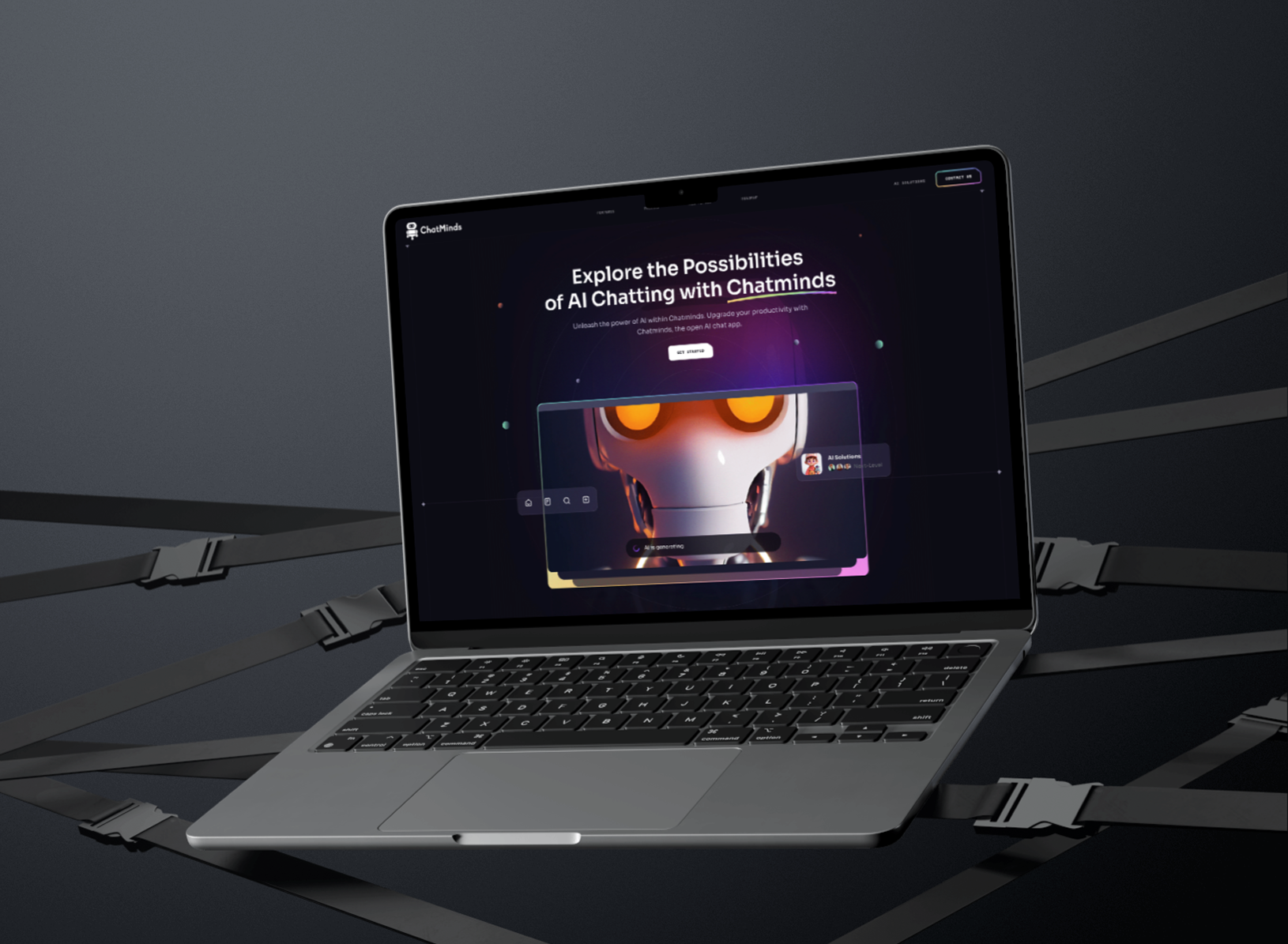
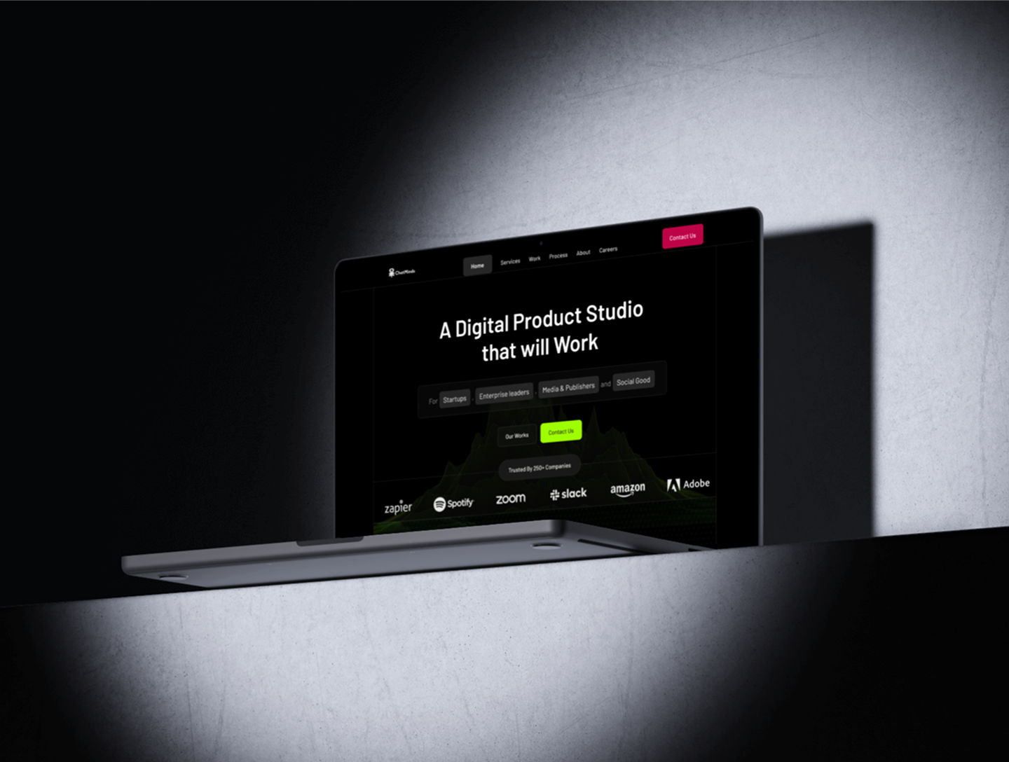
The final solution presents the product as a scalable web platform: easy to scan, easier to maintain, and structured around reusable React components and user-centered AI interactions.
Responsive layouts that preserve hierarchy across desktop, tablet, and mobile.
Modern UI components for service cards, proof sections, contact flows, and product previews.
Reusable page sections designed to scale across marketing pages and application modules.
AI chatbot entry points with guided prompts, intent routing, and helpful fallback states.
ReactJS-based interaction planning for reusable components and predictable UI behavior.
Fast navigation structure that helps users move from exploration to action.
Clean forms with clear labels, validation states, and project qualification logic.
Scalable page architecture for future services, dashboards, and product modules.
Design system and UI system
The design system creates a shared language between product design and front-end development. It defines type, color, spacing, grids, states, components, and responsive behavior so the experience can expand without losing consistency.
A compact type scale separates hero messaging, section headers, service descriptions, form labels, and chatbot messages for better scanning.
Neutral surfaces create a professional foundation, while green, cyan, and magenta accents identify actions, insight states, and AI moments.
An 8px spacing rhythm and responsive grid rules keep sections aligned and prevent content from collapsing on mobile.
Primary, secondary, disabled, loading, and validation states were designed to make conversion flows clear and predictable.
Service cards, proof cards, navigation states, and section modules share consistent padding, labels, and interaction feedback.
Prompt chips, message bubbles, quick replies, escalation states, and input patterns support helpful AI interactions.
Development approach
The front-end approach focused on modular architecture, responsive behavior, maintainability, and performance. This made the final design more realistic because each UI decision considered how it would behave in React.
Component-first React structure for sections, cards, buttons, forms, chatbot prompts, and product preview modules.
Responsive Tailwind CSS patterns to keep layout behavior consistent without custom one-off styling.
Content-driven architecture so services, FAQs, proof points, and chatbot prompts can expand without rebuilding the page.
Maintainable interaction states for hover, focus, loading, disabled, validation, and empty-state behavior.
Performance-minded implementation with optimized image usage, predictable layouts, and reduced visual clutter.
Accessibility and usability
Accessibility decisions focused on contrast, spacing, keyboard navigation, clear labels, mobile usability, and chatbot interactions that do not trap users or hide support paths.
Clear heading order and section labels to support scanning and assistive technology navigation.
Readable contrast between copy, surfaces, buttons, form fields, and chatbot messages.
Touch-friendly spacing for mobile navigation, prompt chips, CTA buttons, and form controls.
Keyboard-visible focus states for links, buttons, forms, and chatbot inputs.
Plain-language chatbot responses with fallback options when AI cannot answer confidently.
Outcome and impact
The result is a polished digital experience that balances product storytelling, responsive UX, AI interaction design, and front-end scalability. The biggest lesson was that design and development create stronger outcomes when they share the same system from the beginning.
The design system creates a reliable foundation for future pages, product modules, and AI interaction patterns.
Users get a cleaner experience across screen sizes, with fewer layout shifts and clearer navigation paths.
The chatbot becomes part of the user journey instead of a floating add-on, helping users qualify needs and find answers faster.
Next steps
The next phase would deepen personalization, analytics, onboarding, component coverage, and application features so the platform can keep evolving beyond a single marketing experience.
Add more advanced AI personalization based on user intent and page context.
Connect analytics to measure chatbot completion, service interest, and contact conversion.
Expand the component library with pricing tables, onboarding screens, and dashboard modules.
Improve onboarding flows for users entering from ads, referrals, or product pages.
Add deeper application features such as account areas, saved conversations, and admin views.
Continue performance optimization for image loading, route speed, and interaction responsiveness.