Role
Product Designer
UX research, flows, UI system, prototype
German Losada
Fintech UX/UI Case Study
A complete UI/UX design system for a next-generation investment dashboard, built to make portfolio monitoring, performance review, and financial decision-making clearer for modern investors.
Role
Product Designer
UX research, flows, UI system, prototype
Timeline
8 weeks
Discovery, IA, design, validation, handoff
Tools
Figma, FigJam, Maze
Plus Notion, Hotjar notes, design QA
Team
Solo case study
Designed with stakeholder-style review cycles
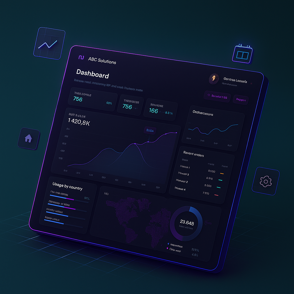
Portfolio value
$420.8K
Daily change
+3.1%
Risk level
Balanced
Project overview
The dashboard was designed as a fintech command center for individual investors who want to understand portfolio performance without feeling buried in data. The product supports daily review, deeper asset analysis, transaction auditing, and watchlist decision-making.
A next-generation investment dashboard for retail investors and early wealth builders who need one clear place to monitor portfolio health, asset performance, market movement, and account activity.
Fintech products win trust when users can understand risk, momentum, and action quickly. The dashboard needed to make complex data feel calm, credible, and useful without hiding important detail.
Investors wanted faster answers to practical questions: What changed today, what is driving performance, what needs attention, and where should I go next?
Create an elegant command center that supports daily portfolio review, deeper asset analysis, and confident investing decisions across desktop and tablet experiences.
Problem statement
Financial information can be dense, intimidating, and poorly prioritized. The UX challenge was to make the dashboard feel powerful without overwhelming users, so investors could understand performance, trust the numbers, and move through key tasks with less friction.
Portfolio views often surface too many numbers at once, making it difficult to identify what matters first.
Charts lack clear labels, comparisons, or time context, so users hesitate before making decisions.
Transaction and watchlist data are frequently separated from performance insights, forcing users to jump between screens.
Important status messages can feel alarming or vague when financial language is not clear enough.
Goals and success metrics
I framed the design goals around task clarity, portfolio comprehension, navigation efficiency, and investor confidence. The metrics below represent realistic product indicators for prototype validation and future launch measurement.
+34%
Target lift from clearer entry points and visible portfolio priorities.
88%
Prototype testers completed portfolio review and watchlist tasks without guidance.
-27%
Fewer steps from overview to asset performance and transaction detail.
+41%
Users reported higher confidence after reviewing contextual insights.
Research and discovery
Research focused on how investors scan dashboards, interpret charts, and decide whether a financial signal is worth action. Competitive analysis of fintech tools showed that trust is built through context, legible hierarchy, and consistent system behavior.
Users preferred fewer priority modules with better hierarchy over dense screens that tried to show every metric at once.
Competitive analysis showed that clear labels, date ranges, tooltips, and neutral language made financial dashboards feel more credible.
Most users wanted to scan performance, allocation, watchlist changes, and recent activity within the first minute.
Users responded better to risk indicators when they explained the signal and next action instead of relying on color alone.
User flows and product thinking
The dashboard experience was organized around common investor behaviors: onboarding, daily overview, portfolio monitoring, asset review, transaction history, and watchlist management. Each flow reduces the distance between a signal and the next useful action.
Flow 1
Collect investment goals, risk comfort, and account connections with progressive steps that explain why each data point matters.
Flow 2
Surface net value, daily movement, allocation health, alerts, and next actions before asking users to analyze details.
Flow 3
Group holdings by performance, allocation, and account type so users can understand exposure and concentration risk quickly.
Flow 4
Combine price movement, historical charting, news context, and position impact in one decision-support view.
Flow 5
Use filters, status indicators, and readable transaction labels to help users audit activity without finance jargon.
Flow 6
Let users track market opportunities, set alerts, and compare watched assets against portfolio goals.
Design process
The process moved from structure to interface detail: define what users need first, test screen density, refine chart and table behavior, then package the dashboard as a scalable fintech design system.
01
Structured the product around review, investigate, and act. This kept daily monitoring separate from deeper analysis without creating a disconnected experience.
02
Explored multiple density levels for KPI cards, chart modules, allocation views, and transaction tables before moving into high fidelity.
03
Balanced dark analytical surfaces with light case-study sections to keep the portfolio page readable while preserving the fintech product mood.
04
Defined reusable cards, tabs, tables, chart legends, status pills, buttons, and insight blocks for a scalable dashboard system.
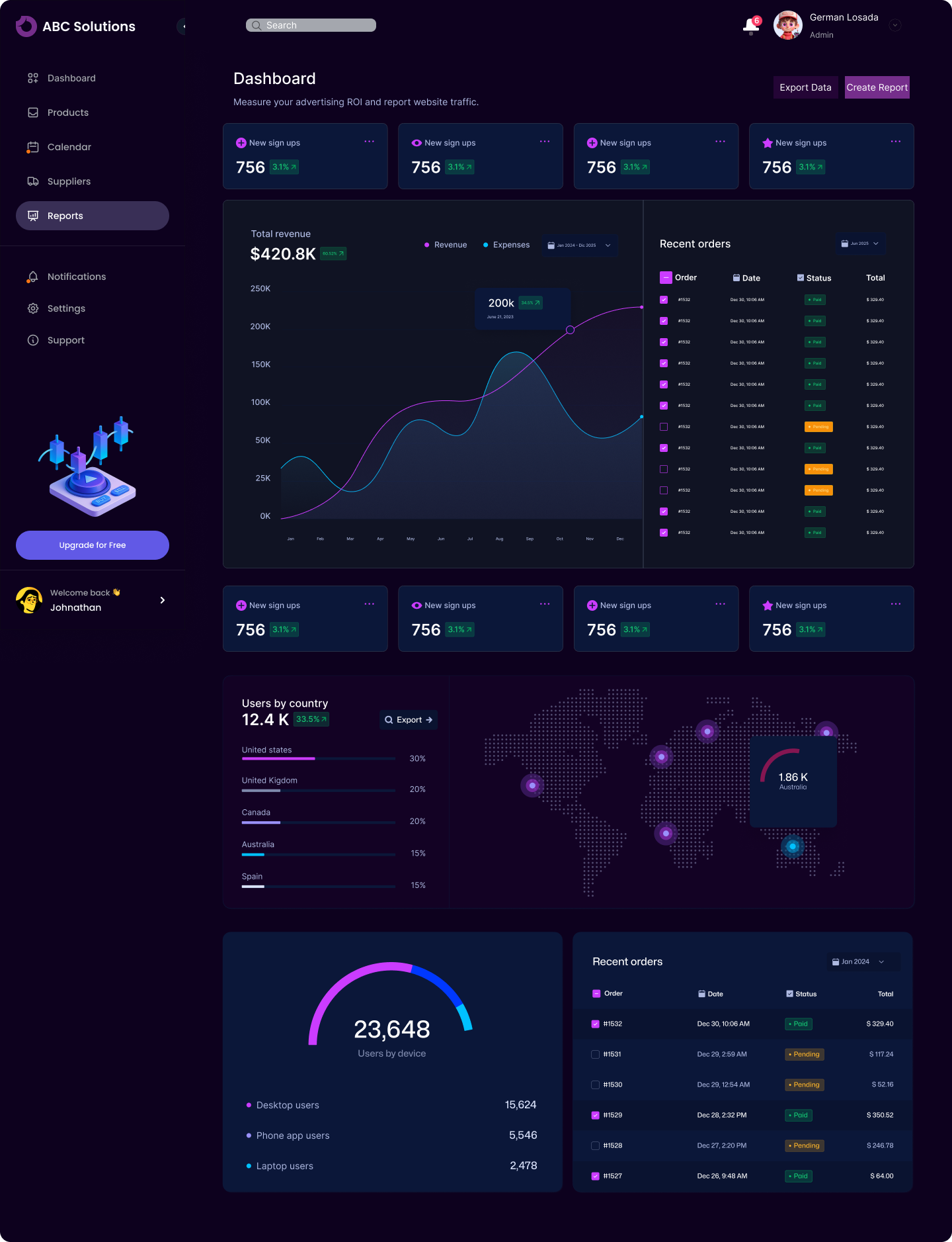
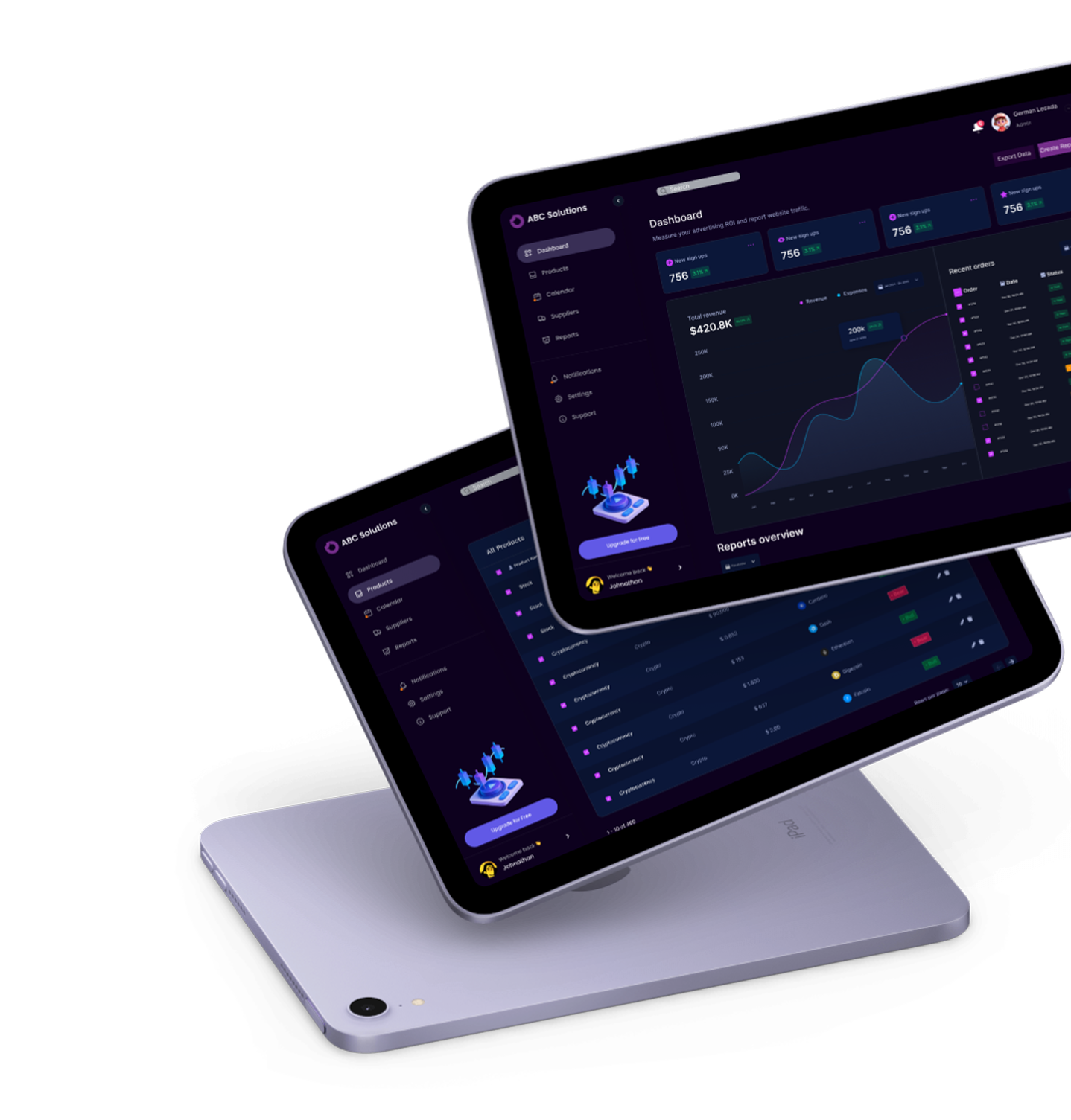
Prototype screens: overview, charts, transactions, and analytics states.
Final solution
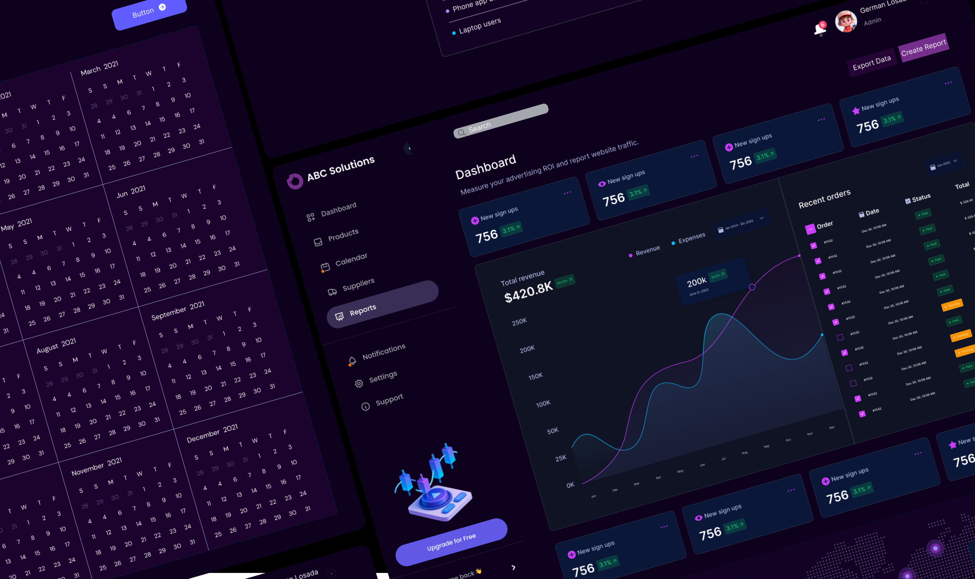
The final interface combines portfolio summary, asset allocation, performance charts, market trends, watchlist data, recent transactions, quick actions, and insight notifications into a focused investment workspace.
Portfolio summary with total value, daily change, risk signal, and goal progress.
Asset allocation view that explains exposure by sector, account, and asset class.
Performance charts with time ranges, comparison lines, and readable labels.
Market trends panel for index movement, watchlist shifts, and relevant news signals.
Recent transactions table with status, date, account, amount, and audit-friendly filters.
Quick actions for deposit, rebalance review, alert setup, and report export.
Notifications that distinguish informational updates from urgent account issues.
Watchlist management with asset cards, price movement, and saved alert states.
Design system and UI system
The UI system was built to support high-density financial data while keeping patterns predictable. It defines color, typography, grids, spacing, buttons, tabs, chart styles, tables, status indicators, and icon behavior.
Deep ink surfaces create focus, off-white areas improve reading, green signals gains, red is reserved for loss or risk, and cyan highlights active chart data.
A compact type scale separates financial values, module headings, labels, helper text, and tabular data without forcing users to decode hierarchy.
A 12-column desktop grid and 8px spacing rhythm keep cards, charts, tables, and side navigation predictable across responsive layouts.
Reusable cards, buttons, tabs, chart legends, tables, status indicators, icon buttons, and empty states support product-ready expansion.
Accessibility and trust
The design uses hierarchy, labeling, contrast, and predictable component behavior to make important information easier to interpret. Accessibility considerations were especially important for charts, tables, alerts, and high-impact financial actions.
High contrast values and labels for fast portfolio scanning.
Chart legends paired with labels and time ranges instead of relying only on color.
Status indicators that combine text, icon treatment, and color for accessibility.
Clear destructive and high-risk actions with confirmation patterns.
Readable tables with consistent alignment for dates, values, and transaction states.
Outcome and impact
The solution helps investors understand what changed, why it matters, and where to go next. As a Product Designer, the key lesson was that fintech UX is less about visualizing every data point and more about designing the right sequence of attention.
The dashboard helps users identify portfolio movement, risk signals, and recent activity without digging through separate pages.
Clear hierarchy, plain-language insights, and consistent status patterns reduce hesitation around dense financial information.
The UI system can support additional investing workflows such as goal planning, recommendations, and deeper analytics.
Next steps
The next phase would expand personalization, deeper analytics, mobile optimization, and guidance patterns that help investors act with more confidence.
Add personalized insights that explain why portfolio changes happened.
Explore AI-assisted recommendations with transparent reasoning and risk education.
Expand deeper analytics for allocation drift, tax lots, and benchmark comparisons.
Optimize mobile flows for fast daily review and secure quick actions.
Introduce goal-based investing tools tied to milestones and contribution plans.
Test collaborative investing features for shared household planning or advisor review.