Role
Product Designer / UX Researcher / UI Designer
Research, strategy, flows, UI system
German Losada
Mobile Fintech UX/UI Case Study
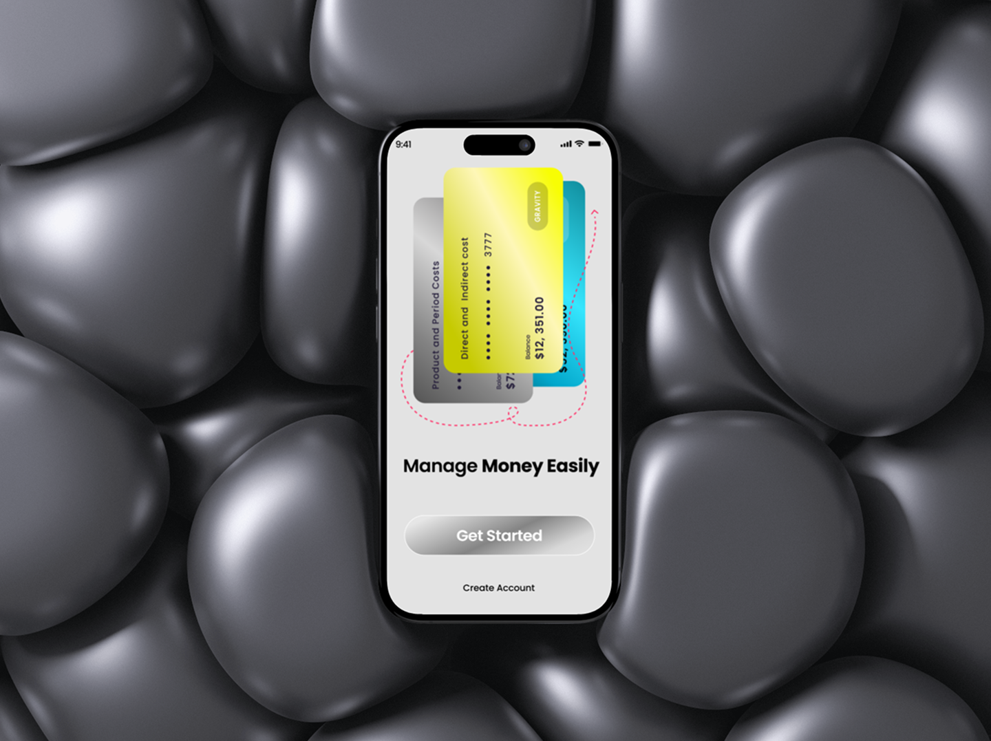
A user-centered financial application designed through research, UX strategy, and UI development to make everyday money management clearer, calmer, and easier to trust.
Role
Product Designer / UX Researcher / UI Designer
Research, strategy, flows, UI system
Timeline
9 weeks
Research, wireframes, testing, high fidelity
Tools
Figma, FigJam, Maze
Prototype testing, notes, design QA
Project type
Solo product case study
End-to-end mobile fintech experience
Task success
93%
Usability
4.6/5
Core flows
6
Project overview
The app supports users who want to understand their finances quickly, complete high-confidence account actions, and build better financial habits without feeling overwhelmed by banking complexity.
A mobile financial app designed to help users understand their money, track transactions, make payments, and review spending insights with less cognitive effort.
Financial products compete on trust and clarity. The app needed to feel secure, approachable, and efficient while supporting everyday account actions that users repeat often.
Users wanted a faster way to see account health, understand recent activity, and complete payments without feeling anxious about making mistakes.
Create a calm, mobile-first financial experience that turns essential money tasks into clear, guided flows for busy users and first-time digital finance adopters.
Problem statement
The UX challenge was to reduce cognitive overload while increasing trust. Users needed clearer flows, stronger accessibility, more predictable feedback, and better information hierarchy for everyday financial interactions.
Many financial apps overload users with balances, charts, offers, and alerts before explaining what needs attention.
Account actions can feel risky when labels, confirmation states, and feedback patterns are unclear.
Poor information hierarchy forces users to search for everyday tasks like transaction review, transfers, and budget progress.
Accessibility gaps in contrast, tap targets, and data labels reduce trust for users who need a more inclusive experience.
Goals and success metrics
I defined success around usability, confidence, engagement, onboarding completion, and reduced friction in core mobile flows such as account review, transaction tracking, and transfers.
93%
Prototype users completed overview, transfer, and transaction tasks without help.
-38%
Projected reduction from shorter steps and clearer account-setup guidance.
+31%
Target lift from faster access to spending insights and account health.
4.6/5
Average rating from moderated prototype feedback sessions.
Research and discovery
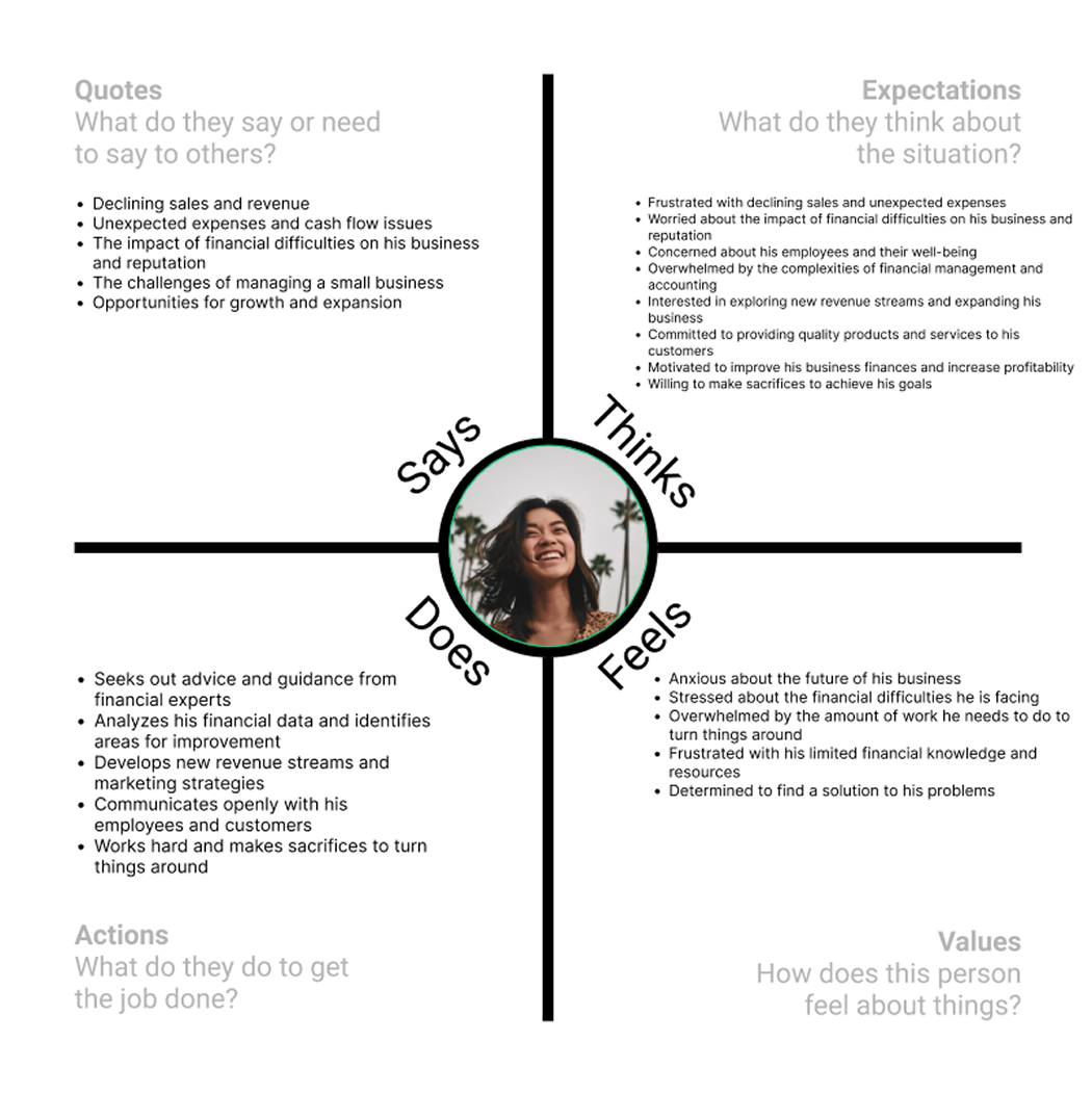
The project was grounded in user interviews, pain-point mapping, behavioral insights, and opportunity mapping. The biggest pattern was consistent: users wanted financial tools that explain what is happening and help them avoid mistakes.
Users were more comfortable with payments and transfers when the app previewed fees, recipient details, timing, and confirmation states before submission.
Participants preferred plain-language labels such as available balance, scheduled payment, and spending limit over technical banking terms.
Users wanted to see the current balance, recent movement, upcoming obligations, and one clear next step before exploring deeper insights.
Readable type, strong contrast, large touch targets, and non-color-only feedback helped the app feel more dependable.

User personas and needs
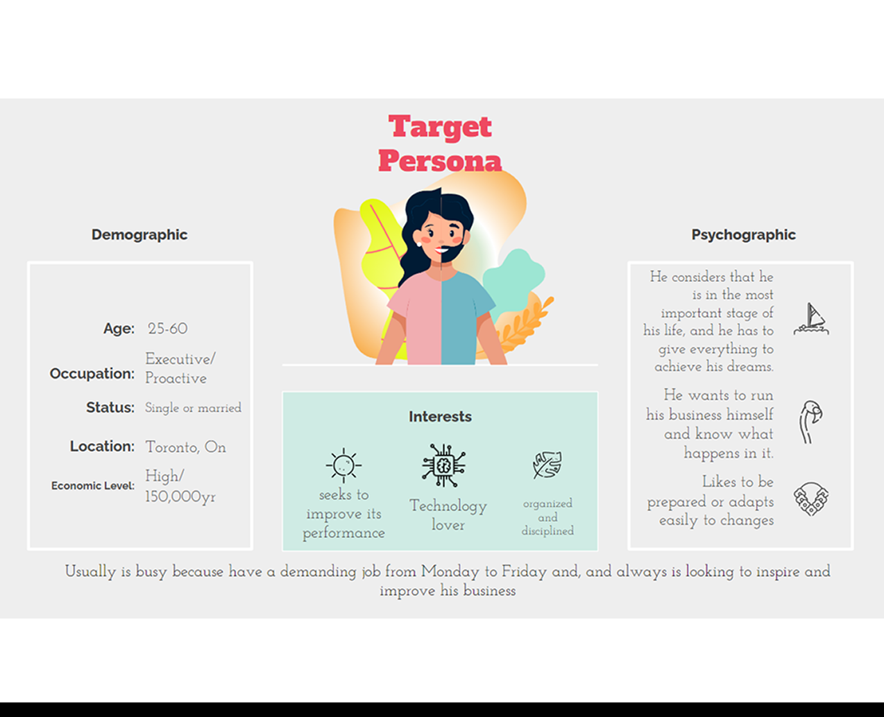
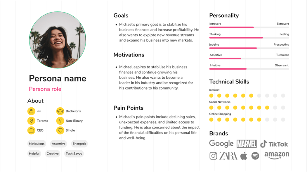
Personas helped keep the product centered on practical needs: quick review, reassurance during financial actions, spending awareness, and accessible language.
Busy professional
Needs: Needs a quick daily money check before making purchases or transfers.
Frustration: Feels overwhelmed when budgeting tools require too much setup.
New digital banking user
Needs: Needs clear labels, reassurance, and step-by-step payment confirmation.
Frustration: Worries about sending money to the wrong account or missing fees.
Goal-focused saver
Needs: Needs spending insights and savings progress that feel motivating, not judgmental.
Frustration: Loses trust when apps show charts without explaining what changed.
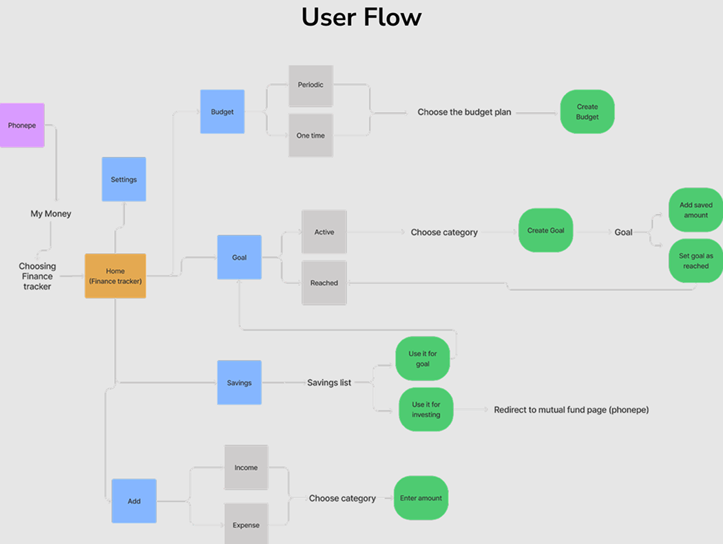
User flows and experience strategy
The experience strategy keeps important financial actions visible, breaks risky tasks into understandable steps, and gives users feedback before and after each decision.
Flow 1
A shorter setup flow asks for only essential information first, then introduces security, account connection, and preferences with clear progress cues.
Flow 2
The home screen prioritizes available balance, recent transactions, upcoming payments, spending insight, and primary actions.
Flow 3
Search, filters, merchant labels, categories, and status states help users understand where money moved and why.
Flow 4
The transfer flow uses recipient review, amount confirmation, fee visibility, and success feedback to reduce anxiety.
Flow 5
Spending patterns are summarized in plain language with visual cues, category breakdowns, and suggested next actions.
Flow 6
Security, notifications, personal information, accessibility preferences, and support stay grouped in predictable locations.

Design process
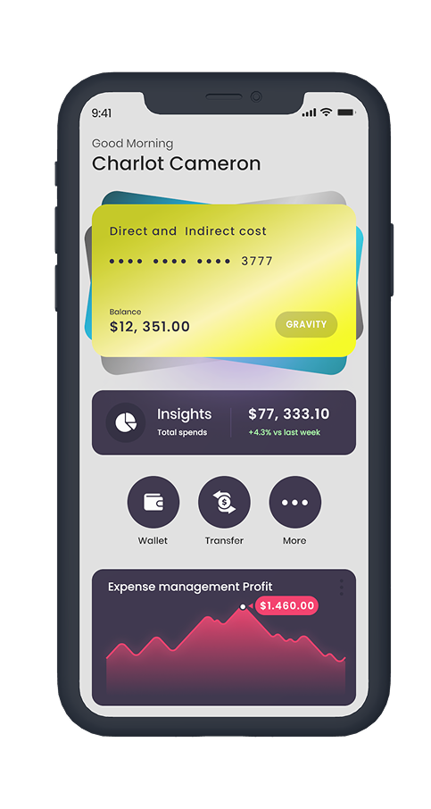
The before-and-after comparison preserves the original interaction: drag the handle to compare screen evolution from early structure to refined UI. Research shaped the hierarchy, labels, confirmation states, and navigation decisions.
01
Grouped the app around overview, activity, payments, insights, and profile so the core financial tasks remained easy to locate.
02
Mapped low-fidelity versions of onboarding, dashboard, transactions, transfer confirmation, and budgeting screens.
03
Reduced screen density, added confirmation steps, improved labels, and moved high-frequency tasks closer to the home screen.
04
User feedback shaped the final hierarchy, especially around payment reassurance, spending context, and navigation clarity.
05
Built a calm visual system with readable cards, friendly charts, accessible controls, and consistent feedback patterns.
Final solution
The final app combines essential account information, transaction visibility, transfer actions, budgeting insights, notifications, and accessible navigation into a mobile experience that feels calm and easy to use.
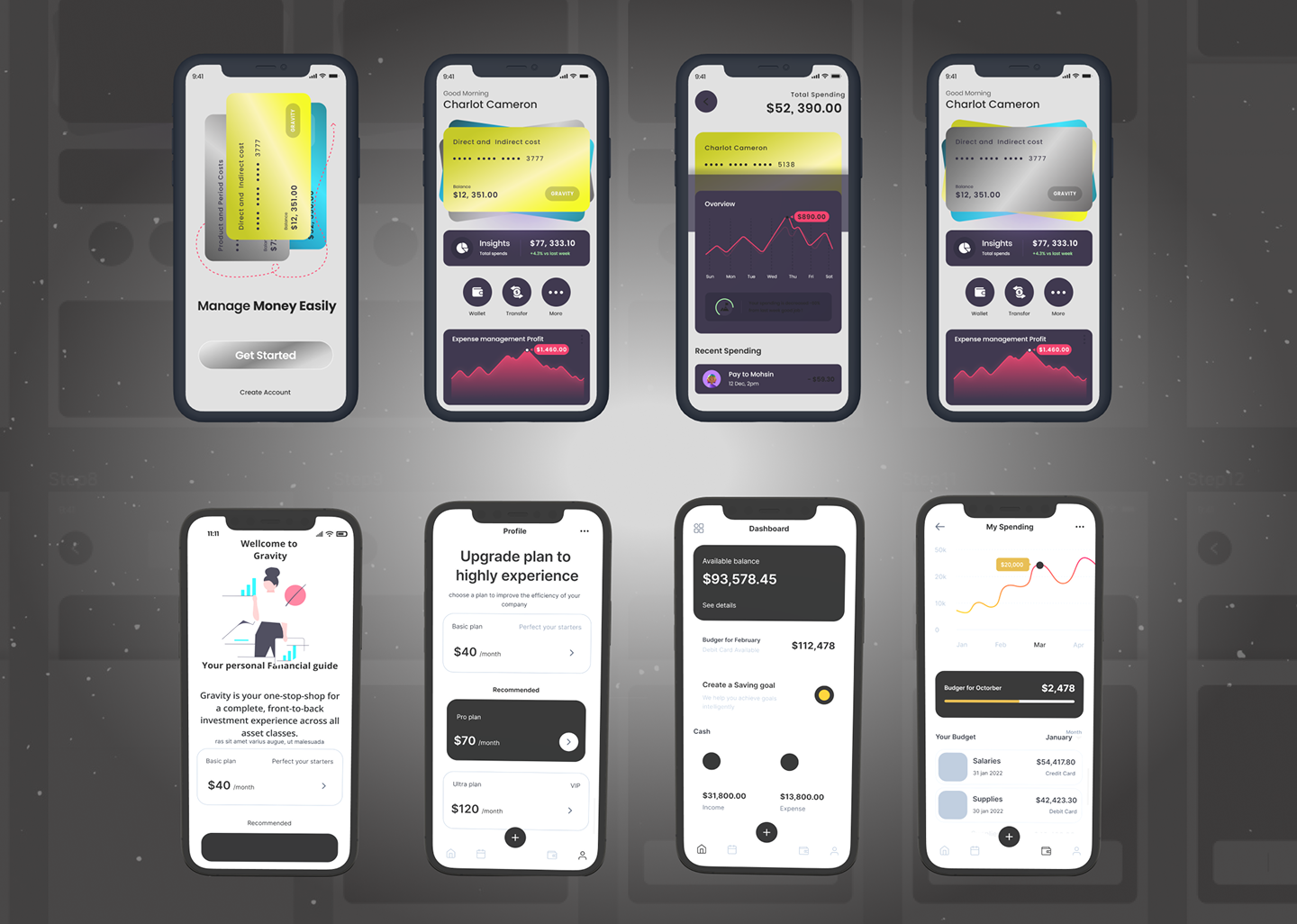
Financial overview with balance, account health, upcoming payments, and recent movement.
Transaction history with searchable activity, merchant labels, category tags, and status feedback.
Transfer and payment actions with recipient review, timing, fee visibility, and confirmation screens.
Budgeting insights that explain spending patterns in plain language and highlight useful next steps.
Notifications for deposits, transfers, bills, low balance, budget progress, and security events.
Clear bottom navigation that keeps overview, activity, payments, insights, and profile within reach.
Accessible UI patterns with strong contrast, readable values, and touch-friendly financial controls.
UI system and visual design
The UI system makes the app feel consistent, scalable, and product-ready through typography, color, iconography, cards, forms, buttons, navigation, and status feedback patterns.
Large financial values, clear labels, and compact supporting copy make balances and actions easy to scan on mobile.
A high-trust navy and charcoal foundation pairs with green for positive money movement, blue for actions, and rose for warnings.
Simple line icons support key tasks such as transfer, card, bill, security, search, categories, and profile settings.
Account cards, transaction rows, amount inputs, recipient fields, and confirmation panels follow consistent spacing and state rules.
The tab structure uses familiar mobile patterns with strong active states and labels that avoid ambiguous finance jargon.
Success, warning, pending, declined, and secure states combine color, labels, and icon support instead of relying on color alone.
Accessibility and usability
Because financial actions can carry real consequences, accessibility decisions were integrated into layout, labels, touch targets, contrast, charts, and feedback patterns rather than added after the visual design.
Color contrast was checked for primary financial values, buttons, forms, and transaction states.
Touch targets were sized for thumb reach across bottom navigation, quick actions, and transfer controls.
Labels explain what each amount, fee, status, and category means without requiring financial expertise.
Charts and insights include text summaries so users do not need to interpret visuals alone.
Confirmation states help prevent costly mistakes during payments, transfers, and account changes.
Outcome and impact
The final solution supports engagement, clarity, and confidence by reducing unnecessary complexity in the moments where users need reassurance most. The biggest lesson was that financial UX succeeds when the interface makes risk, action, and feedback easy to understand.
Users can review account health, understand transaction movement, and complete financial actions with clearer reassurance.
The core flows reduce unnecessary steps and make everyday actions easier to repeat on mobile.
The UI system supports future growth across budgeting, savings, recommendations, and accessibility settings.
Next steps
The next phase would expand intelligence, personalization, accessibility, and analytics so the app can continue learning from user behavior while staying clear and trustworthy.
Add smarter financial insights that explain spending changes and recurring patterns.
Introduce personalization for budgets, reminders, savings goals, and financial education.
Explore AI-powered recommendations with transparent reasoning and user control.
Improve budgeting tools with monthly planning, category limits, and progress coaching.
Add deeper analytics for retention, onboarding drop-off, transfer completion, and feature usage.
Expand accessibility enhancements with screen-reader testing and reduced-motion preferences.